One Size Fails All
Why Your Data-Driven Decisions Might Be Leading You Astray
We've all been told to be data-driven. To let the numbers guide us. To trust in metrics over instincts.
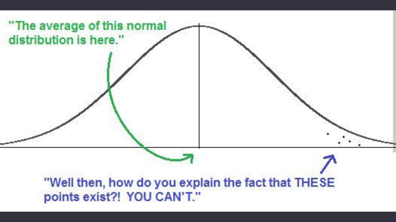
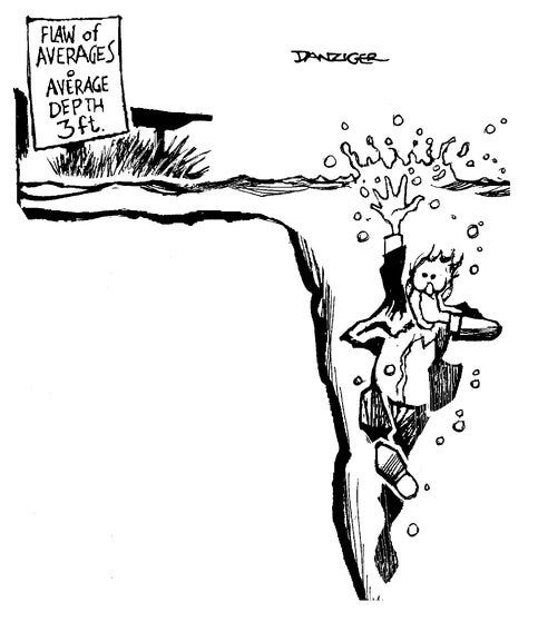
But what if the numbers we trust most are deceiving us? What if our sophisticated dashboards and careful measurements lead us astray, not because we're measuring wrong but because we're averaging right?
Every business leader staring at their average metrics sees the same comforting illusion. Averages are mathematically sound, perfectly reasonable, and generally wholly misleading.
Designed for No One
In the late 1940s, the US Air Force faced a puzzling problem. Despite using the most advanced technology of the time, its planes were crashing at an alarming rate.
At its worst point, seventeen pilots crashed in a single day.
The brass initially blamed pilot error, training programs, and even the mechanics. None of the explanations made sense, so their attention shifted to the planes themselves. Officials wondered if there was a flaw in the design of the cockpit that would help explain the difficulty pilots had controlling their aircraft.
Initially designed in 1926, the cockpit in use across the fleet was built to conform to the average pilot's dimensions. Everything from the windshield height to the distance between the pedals and sticks was designed with the average pilot in mind.
Perhaps the average pilot had grown since 1926, and the solution was to update the design elements to reflect the new average. Thus, the most extensive study of pilots began, with more than 4,000 pilots evaluated on 140 dimensions. The researchers considered everything from thumb length, crotch height, and the distance from a pilot’s eye to his ear.
One of the researchers assigned to this work had his doubts. Lieutenant Gilbert S. Daniels wondered how many pilots were truly average and made it his mission to find out. When he compared the measurements of the individual pilots to those of the "average pilot,” not one of the 4,000 enlisted pilots fit within the average range across the 10 physical dimensions believed to be most relevant for design, including height, chest circumference, and sleeve length.
One pilot might have a longer-than-average arm length, but a shorter-than-average leg length. Another pilot might have a big chest but small hips. Even more astonishing, Daniels discovered that if you picked out just three of the ten dimensions of size — say, neck circumference, thigh circumference and wrist circumference — less than 3.5 per cent of pilots would be average sized on all three dimensions.1
The average pilot didn’t exist. The cockpit designed for everyone accommodated no one.
This revelation led to the birth of adjustable seats, pedals, and other innovations we take for granted today.
More importantly, it highlighted a fundamental truth: averages are informative but rarely actionable.
From Cockpits to Coffee Shops: The Flaw of Averages
The same fallacy that nearly doomed the Air Force continues to plague modern businesses.
Consider Starbucks, which recently learned this lesson the hard way when it experienced its first quarterly sales decline since 2020. The culprit? A staffing algorithm that fell into the same trap as those 1926 cockpit designers—optimizing for the average at the expense of reality2.
While robust, accounting for order forecasts, product availability, and average preparation time, the staffing model failed to adequately account for the ballooning special customer requests. As a result, wait times skyrocketed from an average of less than 5 minutes to closer to 10 minutes, with 10% of customers waiting over 15 minutes!
In hindsight, it seems obvious that broader averages are misleading, but our attention is generally focused on what’s going wrong rather than what’s going on beneath the surface. Consider the cascading effect of managing the average at a call center amid a shift in customer strategy.
The company’s "average order size" of $100 led them to optimize their website for SMB purchases – while completely missing that 80% of their profit came from the 5% of enterprise customers spending over $500. These valuable customers now struggled to find enterprise-specific features buried in a website designed for small businesses.
Subsequently, the call center celebrated a reduction in "average handle time." However, it failed to see that this was a function of a shift in customer mix (e.g., more low-end customers with more straightforward problems to solve naturally have shorter call times). It also missed that the more profitable enterprise customers were now on hold longer, which drove up churn rates.
Despite "average employee satisfaction" of 8/10, the smaller enterprise team dropped to a 3/10 after dealing with never-ending customer complaints from the long wait times.
Why We Keep Falling for the Average Trap
Despite mounting evidence that averages mislead us, organizations continue making these three critical mistakes:
The Amalgamation Fallacy occurs when we treat distinct groups as homogeneous blobs and use one metric to guide our choices. Sometimes, one metric is sufficient to base a decision on—for example, using body weight to prescribe Tylenol. However, the danger is extending the heuristic, such as using only body weight to prescribe antidepressants while ignoring brain chemistry, medical history, and lifestyle factors.
The Mean Masquerade occurs when we conflate “average” and “typical.” As we’ve seen above, this substitution can be costly when the population is spread such that the mean and median are materially different. If you intend to serve the average US household, your approach is likely dramatically different depending on if you’re selling to the median (~$70k income/year) vs the mean (~$142k income/year).
Green is Good. Our (over)reliance on averages has worsened in the age of dashboards and real-time analytics. If we’re not careful, we can be lulled into thinking everything's okay because the average looks good. This is how companies lose their best customers while their metrics still show green.
The Right Way to Use Averages (Yes, There Is One)
Averages aren't useless – they're just dangerous when misused. Think of them like satellite photos: great for seeing the shape of a continent, useless for finding your house keys.
Use averages when:
Communicating broad patterns to busy executives (but always have the detailed breakdown ready)
Example: "Overall customer satisfaction is 8/10, but here's the crucial breakdown: Enterprise is at 9.2, Mid-market at 8.1, and SMB at 6.8"
Setting initial benchmarks (while actively looking for segments that deviate)
Example: "Our average response time is 4 hours, but we've identified three distinct customer segments that need different targets..."
Identifying areas that need deeper investigation (treat averages as questions, not answers)
Example: “Our average handle time is up 20% week-over-week. I wonder what’s driving that…”
Making rough comparisons over time (but be ready to explain which segments drove the changes)
Example: “Our average order value has declined over the last seven weeks. I wonder if that’s Enterprise customers buying less than usual or if our mix has shifted to our smaller SMB customers.”
Disaggregating: A Practical Guide to Segmentation
Here's where theory meets practice. The key isn't just breaking down data – it's breaking it down intelligently. Here's your playbook on how and when to disaggregate:
1. Start with Natural Segments
Don't overthink your first cut. Look for obvious divisions:
B2B: Enterprise/Mid-market/SMB
B2C: Premium/Standard/Basic subscribers
Geography: Major markets/regions
Customer tenure: New/Established/Legacy
Word of warning: notice that these natural segments are inherent to the population you’re studying. Avoid the temptation to segment based on how the company treats the population, as this will have a natural bias in the data that will lead you down a similarly painful path. For example, suppose you segment customers based on their purchase pathway rather than their size. In that case, you’re missing insights on the entire customer population (e.g., Enterprise customers) because you’re focused on a subset (e.g., Enterprise Customers who purchase through free trials).
2. Hunt for Hidden Populations
Watch for these telltale signs of distinct groups hiding in your data:
Bimodal distributions (the "camel hump" pattern)
Unexplained variance in outcomes
Clusters of customer complaints
Dramatic differences in usage patterns
3. Follow the Money (But Not Just Revenue)
Track these often-overlooked metrics:
Customer acquisition cost by channel
Support costs per segment
Feature usage patterns
Profitability (not just revenue)
4. Mine the Front Lines
Your team knows things your data doesn't. Anecdotes can’t always be wholly relied upon, but they can highlight opportunities you didn’t see in your initial packaging of the data.
Ask support what questions keep coming up
Have sales explain why deals are really lost
Get product teams to share user feedback patterns
Review customer success calls for common themes
Finding Your Sweet Spot: The Goldilocks Principle
Too broad, and you're flying blind. Too granular, and you're paralyzed by detail. Here's how to find the right level of segmentation to meaningfully drive your business:
Start With Major Divisions: Begin with 3-4 obvious segments (like customer size or product type) that the business can action against.
Test for Material Differences: Look for variations that would change your strategy. A 2% difference probably doesn't matter; a 20% difference definitely does.
Drill Down Strategically: Only segment further when:
The sub-groups need different treatment
You have the resources to act differently for each group
The population size is large enough to be statistically valid
Know When to Stop: You've gone too far when:
Segments become too small to act on
Different segments would get the same treatment
The cost of separate handling exceeds the benefit
The Path Forward: From Average to Awesome
Here's your action plan for tomorrow morning:
Audit Your Dashboards
Flag every average that drives decisions
List three potential segments for each
Pick one metric to break down this week
Question Every Average
Who's hidden in this number?
What extremes is it masking?
What decisions are we making based on this?
Start Small, Scale Smart
Break down your most important metric first
Document what you learn
Expand to other metrics methodically
Final Thought
No great product was ever built for the average user, no revolutionary service was designed for the median customer, and no market was ever transformed by appealing to the statistical mean.
Excellence lives in the edges, not the average.
The average company will keep optimizing for the average customer. Your opportunity lies in serving real customers—in all their messy, non-average glory.
The End of Average, Todd Rose


Very interesting